In an earlier post I talked about color as it relates to shadows and the planes of the body. There is more to the coloring process than just that.
I have a confession to make- sometimes I screw up when it comes to drawing. It happens to every artist at one point or another. Every once in a while I will phone something in. It usually means that I'm not clicking with whatever it is I'm working on, whether it's because of a time crunch or something else. It doesn't happen all the time, but it does happen. In times like that I usually hope the inker or colorist can bring something to the artwork.
Case in point - Len Strazewski's Milos 2. I was not on my game with this story. Unfortunately, not only was I the penciler, but I was also the inker AND the colorist. To be honest, my inks probably made the artwork worse, but I think my colors redeemed it:
I think that there are several reasons why this works better with these colors. The first, obviously, is the shadow modeling. The planes are correct and the light sources stand out. The second reason is that there is a good contrast of colors- warm colors ( reds, oranges, yellows, browns) are next to cool colors ( blues and purples) which makes the figures pop more. Lastly, the dark blue colors and the highlights hide mistakes, whether it be with the anatomy or the composition.
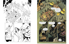
Unfortunately, color has the capacity to destroy the artwork as well. An example of this is what was printed in the Kong: King Of Skull Island trade paperback. A little background is necessary before I show what I mean. When I was first contacted to work on the book, I drew single issues- #3, #5, and half of #4. There was a time crunch and I ended up speeding through the issues. The colors for the single issues were phenomenal. When it came time to collect the issues in a trade, we had more time. I was asked to redraw the art and improve it. Unfortunately, we lost the original colorist and he had to be replaced. Here is the art for both the single issues and the trade:
While the b/w art for the trade is better, the coloring is far worse. It makes the art look flat, there is no kind of contrast, and the colors are dirty. The second colorist has no sense of body planes, highlights or color variation - greens are green, browns are browns. The no subtly to any of it. If I had to pick which art looked more pleasing to the eye, I would go with the single issue pages, even though the b/w art had poor anatomy and drawing. The color saves the work.
When line and color come together, they should compliment each other. Sometimes that's not always the case. It is important to note that just because someone knows Photoshop doesn't mean they know how to color. and understanding of anatomy, page layout, and color theory is just as, if not more, important in the digital age as it was in the traditional age.


