Sunday, December 29, 2013

EVERY IMAGE TELLS A STORY


Reference books are a dime a dozen. Really. There are so many "How to" "Art Of" books that it's easy to lose track. For Christmas I received a copy of Lifestyle Illustrations Of The 50's. I decided, especially after looking at all the art books on my shelf ( including the follow-up to this book - the 1960's), that I wasn't going to just put it on the self and let it collect dust. So I divided the book into years and will devote one week of study to each year.

Artist Coby Whitmore from Women Magazine


As I poured over the year 1950, I found that upon first glance I was impressed with the art. On second glance I noticed the style. On third glance I studied the composition. It wasn't until I went through the book several times that I noticed- really noticed- the story that was being told with each illustration. From romantic to family to daily life scenes I found myself creating stories in my head based on whatever art I was looking at.


This was, of course, why these illustrations were done in the first place- to accompany any stories that might go along with them in the magazines in which they were printed. However, the images are so striking and engaging that it got me thinking. If they were part of sequential art, what would the other images look like?


Here's another question: If any panels from the comics I ( or anyone else for that matter) were pulled out of the sequence of a page, would they have the impact of any one of these illustrations? If not, should they? Is every picture drawn important or does there need to be bridges in between impactful images the same way there are bridges in between sentences? Does, and should every image count?

I don't know the answer to this, but I am going to find out...

Tuesday, September 17, 2013

NOW ON SALE


Femforce #164 is on sale now and features not one, but 2 stories by me! The first is a She-Cat solo story which features a Raiders Of The Lost Ark type chase against time  ( one of the most enjoyable stories I've ever drawn). The second is a reprint of one of my favorite Miss Masque adventures. The description for the issue is as follows:

The FEMFORCE have faced many threats over the past two decades, and perhaps the most difficult to vanquish are those who attempt to play out their maleavalence within the boundaries of the law- and this issue, the FF (In the form of MS. VICTORY, SYNN and TARA) must parry with an old nemesis seeking to use the FF for his own gain. A solo covert mission turns to high-speed action for SHE-CAT as she fights to smash an underground organization bent on death and destruction, and super-scientist STARDUST ends up dealing with demonic manifestations in a pinch when forced to substitute for NIGHTVEIL, still on hiatus with her love interest, the recently-returned BLACK COMMANDO, as NV and BC are off for an extended session of R &R, which will eventually lead the pair into unexpected danger. In the conclusion of Eric Coile’s 1950′s-era retro FF story, the Eisenhower-era FF (Miss Victory, She-Cat, Blue Bulleteer and Rio Tita) team up with Fighting Yank, Yankee Girl and The Avenger to finally give the villainous Red Square his comuppance- but not before they must face the emerald threat of MEGALODONNA!! Guest-stars include YANKEE GIRL, whose accidental time-trip puts her in the right place at the right time to save the life of Merlin in “A Yankee In King Arthur’s Court”; STORMY TEMPEST, as she faces dwarf-sized cannibals and giant Amazon warriors in outer space in “These Boots Are Made For Walking”; DINOSAUR GIRL in the 1940′s-era adventure “The Thing With Two Heads’, and an encore presentation of MISS MASQUE in “The Funny Face Of Death”. Art by Eric Coile, ChrisAllen, Rock Baker, Scott Larson, Mark Heike, Stephanie Heike, Jeff Austin, Scott Shriver, Bill Black, and Mark Dail; stories by Bill Black, Mark & Stephanie Heike, Eric Coile, Mark Holmes, Frank Tra, David Watkins and Stephane Durand.


Wednesday, August 7, 2013

EXPERIMENTING WITH FIGURE DRAWING

On average I try to get out to do figure drawing with a live model at least once a week. Over the past few years, I've tended to do all of my drawings in pencil. Recently I've decided to change media, using not only pens, but markers as well. I block out the shadows before putting in details in order to get a better understanding of the figure. Here are the results of my work:

Here are a couple of 5 minute pen drawings using different color pens


These took 3 minutes each. I started with the lightest color and
moved to the darker shadows

These were 25 minutes each

I am continually surprised at how much I can get done in a short amount of
 time. Each of these drawings took one minute.


I am going to continue to evolve with the pens and markers and do my best to perfect the work. I may move to grays or sepia tones. Once I feel that I've done that I will move on to other media, such as paints or pastels.

Friday, June 14, 2013

THE POWER OF SILHOUETTES

Silhouette is defined as "the image of a person, an object or scene represented as a solid shape of a single color, usually black, its edges matching the outline of the subject. The interior of a silhouette is featureless, and the whole is typically presented on a light background, usually white, or none at all." Though simple, silhouettes convey the complicated.

I first became aware of silhouettes as a story telling method when I was a kid of around 11 or 12. I was a big fan of the Blondie Comic Strip and had found some of the old Harvey comic books that had been published during the 1940's and '50's. While I was reading one of them, my Father looked over my shoulder and pointed out something special about the page I was reading. The figures were all in black, but yet you could tell who they were and what they were doing. My 11 year old mind listened and filed this information away, not quite knowing what to do with it but instinctively knowing that it was important.


From Chic Young's Blondie #93,  August 1956, published
by Harvey Comics


Though the years, I occasionally used silhouettes in some of my comic pages, but just threw them in there to cut down on drawing more details, or for the sole purpose of adding my black to pages. 


It wasn't until an editor at DC Comics looked at some of my work, that I realized how significant silhouettes were. He pointed right to one of mine, called it "breathtaking" and cited examples of Darwyn Cooke and Mike Mignola as masters of blacks and silhouettes. While I had used them occasionally, I had not thought of it in those terms. Now I try to add at least one silhouette to each page I draw.

I'v decided to go a bit beyond that lately. In an attempt to experiment more with what I'm creating, I've started to do little water color paintings with silhouetted figures.


 I'm not sure where this is leading, but it's going somewhere. If nothing else, It shows how something simple can even be dramatic.


Tuesday, June 11, 2013

ON SALE THIS WEEK: FEMFORCE #163

 I penciled an  8 page Tara Fremont for Femforce #163, which will be on sale tomorrow:


 As the FF basks in the glow of happiness from last issues’ reunion between NIGHTVEIL and her long-lost love, The BLACK COMMANDO; evil machinations are afoot on the West Coast. While both NV and Ms VICTORY are absent, SYNN makes a rash decision to act on an apparent monster attack in Hollywwod. SHE-CAT, TARA and STARDUST are pulled in after her, and what LOOKS like an incident caused by two villans out of the FF’s past is ACTUALLY the work of two very new malafactors, in “I Put A Spell On You”, Written by Mark & Stephanie Heike, penciled by Rock Baker and inked by Mark Heike. Then we pick up with Ms. VICTORY in Japan, of all places. While investigating a tip there on the troublesome RENEGADE, Joan finds herself embroiled in a conflict with members of a Japanese super-science defense league. It’s giant robots, oriental masterminds and Asian warrior girls galore, in “V Is For Victory”, written by Mark Holmes and illustrated by Rock Baker and Jeff Austin. Then, take a trip back to 1956 when the FF team up with YANKEE GIRL and The FIGHTING YANK to face off against a near world-shattering menace created by the evil RED SQUARE, in “The Coming of Megaladonna”; written and drawn by Eric Coile, with inks by Bill Black. Next, TARA FREMONT tells the rest of the FF a tale of jungle(?) adventure and intrigue from her college days in “A Jungle Girl In Jersey”, written by Mark Holmes, with art by Scott Larson and Scott Shriver. Then, an untold tale out of the 1947 volume of the casebook of The BLUE BULLETEER; “Noir”. BB shadows a doppleganger in an unlikely locale to smoke out a killer, and ends up bagging two in the bargain. Written by Mara Grundmeyer and Mark S. Dail, with art by Eric Theriault, Mark Heike and Scott Shriver. Finally, a double-dose of alien giantess excitement with TWO episodes of the GAMMAZON HOUSEWIFE saga. First, Gammazonian giantess emigree Kar’Ri Conquest risks life, love and home against a group of former government elite troops gone renegade in “Alien Combatant”, written by Eric Johnson with art by Dan Gorman and Jeff Austin. It guest-stars SYNN, STARDUST and ROBERTA STROCK. Then, in “Living Like A Queen”; old Gammazonian cohorts invade Kar’Ri and Tom’s quiet suburban neighborhood for a showdown in a tale co-starring  the FF’s own TARA (“Too Tall”) FREMONT!! FF #163 is 84 pages of action, adventure, glamor and excitement.

Also, one of my previous stories "Trophy Wife Scorned"  was reprinted in Femforce #160. 


Both comics can be purchased HERE


Wednesday, June 5, 2013

ANN O' CONNOR AND THE CREATIVE SPIRIT

 Ann O' Connor's  artistic creations included Origami work.
Photo  courtesy of Carolyn Backis (c) 2013


" For some reason, I grew up thinking that to be an artist one had to be able to draw. I also believed that creativity was something only artists had. Since I was not able to draw very well, I thought I could never be an artist, and therefore, I suppose for consistency's sake, I also believed I was not creative. I have no idea whether I might have chosen the path of an artist, but the fact is that it was not open to me. It was not within the realm of possibility in my mind".
Ann O' Connor,
The Twelve Unbreakable Principles Of Parenting
ACTA  Publications 2006

When Ann O' Connor passed away on April 24, 2013, she left a tremendous legacy. Ann had been the Faith Formation Coordinator  at St. Gertrude's Catholic Parish in Chicago. She brought to the church, and to every person who met her, a sense of wonder and beauty that can only be found with those truly connected to the world. Ann was more than a " coordinator", she was an artist who used her creative talents to teach and inspire, leaving a mark on the people who knew her. 

It was completely impossible to know Ann and not absolutely adore her. She was one of those people who’s inner light shone out in almost every encounter with her. For everything that was shown on the outside, what was happening on the inside was far more special.

Ann O' Connor and I
Holy Saturday 2000
            
Ann was curious about the world and loved to examine it. Whether it was in the morning while she was walking her dog along the beach as the sun came up, or by visiting an art museum and noticing something new to ponder, Ann would examine things from every perspective she could imagine. She would investigate and think long and deep about everything that presented itself to her. When she finally made a decision about something, she would share it from a perspective that made it poetic.

Her thoughts didn't just range on what was, but also how little things could be changed to provide a better experience. One fantastic example of this a story she shares in her book The Twelve Unbreakable Principles Of Parenting. She and her family were participating in a country wide grassroots symbolic effort to promote energy conservation known as "Roll Your Own Blackout" in which people  turned off all electricity for three hours. As she and her family gathered around, her son grabbed the box where the candles were stored. As she watched him open the box, she immediately regretted the fact that the candles within were cheap, broken, and used. She wished that the box had contained fine beeswax candles in pastel colors, individually wrapped with different flavors. She felt that if that had been the case, the scents would have become intwined in her children's memories of childhood and whenever they would smell those smells in the future, the kids would remember their house and the experience of growing up. She took the time to look at something ordinary and think of a way to make it extraordinary. 

In addition to co-authoring A Guide to the windows
of St. Gertrude, 
 and writing for US Catholic, Ann published
her own book in 2006


Ann looked at the world with an artist’s mind. She loved art, but was unable to draw. She loved music but was unable to play an instrument. These roadblocks did not stop the creative spirit inside of her, instead she found ways around them and used her creativity in such a way that was unique and inspiring. She collected. She invented, She instructed. She created. She wrote. 

Ann was greatly inspired by The Artist's Way
by Julia Cameron

"...art is not only drawing but it is everything: music, theater, dance, photography, writing, cooking gardening, conversation- anything, in fact, that is accomplished with truth and beauty in mind...in short, art is life and life is art."

"Human beings cannot not create. Creativity is not something only artists do, it's something we all do everyday, whether we are aware of it or not"


Ann put together books of poetry, some of which were striking, sad, and yet completely beautiful. She used these to teach, but they served another function – they helped her to understand the world. When she showed them to others she took their experiences and their perspectives and rolled them into her own. Then she gave them back, in her own unique way. Using what she learned from all kinds of different sources, ranging from lectures and readings to live theater and dance, to invent situations and rituals which allowed the participants to enter into the sacred stories themselves. The interesting thing about this is that these creations spawned new ideas and new creations from Ann themselves. The cycle she started continued to move forward and create from itself.

Some of Ann's Origami work courtesy of Carolyn Backis (c) 2013

On the Prepare The Word website, where  Ann had been a contributing author, she is listed as a "writer, bookbinder, and paper artist". While all this is true, it does little to describe her.  Ann O' Connor was a creative spirit who used art to it's fullest, allowing it to touch every aspect of her life and then turning it into something that touched others lives. She was truly one of a kind.

One of Ann's many mobiles which hangs in the
back of St Gertrude's parish. Photo taken  from
St. Gertrude's bulletin for April 28,2013


Monday, June 3, 2013

BRANCHING OUT

In an effort to keep my senses sharp on the comic book work I've been doing, I've decided to take the time to do other types of illustrations. This all began when I started to do some of the quick sketch drawings, that I try to do every week, in pen as opposed to pencil:


These were one minute sketches done at the Drawing Workshop
over the weekend


My goal is to start doing all gesture drawings in ink as well:

Quick gesture drawings on on my commute home last week


In an attempt to use up my old marker refills left over from the old storyboard days, I created this. The first thing I realized is that the ink from the refills works the same way whether it be on a marker nib or a paintbrush. While that brought back a few memories, it also reminded my why I didn't really care for markers.

I also drew some faces using a soft pencil:


And created a little watercolor painting:


Lastly, I took some characters out of a book of photography that was used by Norman Rockwell to create his paintings ( Norman Rockwell: Behind The Camera by  Ron Schick) and did colored india ink illustrations of them.


These exercises are fun and educational in many different ways. Look for more coming soon.

Friday, May 31, 2013

UNPUBLISHED WORK

Part of being a commercial artist is having the experience of working on a project for someone and having it disappear with no hope of seeing the light of day. It happens to everyone at some point to both the beginner and the professional. It's just a reality of the business. 

This is both a curse and a blessing.

On the one hand, we artists want to see our work published. We've toiled over it, doing the best job we can. We need to feel as if we were doing it for a reason. It doesn't matter if we get paid for it or not. We have put our time and effort into the project, forsaking our friends, family, and all aspects of our personal lives. We are left with, as a result, a number of empty promises that the work will "someday" be published "once this ( fill in the blank) happens". This does nothing but make the illustrator feel as if he or she has wasted time and effort for no reason. It's very demoralizing and completely unfair to those doing the work.

One the other hand, having this work hidden away forever can be the best thing that's ever happened to the illustrator. Although this happens at various points in an artist's career, the reality is that some of the work done happens at the beginning of one's career and the work is bad. Actually, the work is horrible! I personally have looked back at projects that I thought were good only to see that what I had done was a blight on artists everywhere. Best to leave these things buried.

One example of this a project I had right out of art school. I had just graduated from American Academy Of Art in 2004 when someone contacted me to do Norman Rockwell-like paintings for a book. The paintings were to be headshots of famous people throughout the past hundred or so years. Because I had done a number of gouache paintings in my final semester of school, most recently a 6 page painted biography of my life, I felt I could do a good job. I did 125 paintings in a month and a half, handed the work over and waited for the book to be published.

Hard at work on my paintings in 2004


It never was.

Oh, there was a website and it was solicited, but the book never came out.

 I am  contractually not allowed to show the artwork for this
project. I'm not too broken-hearted about that...


Last week I looked at the scans I did of the artwork. The illustrations started out as just ok, and then went downhill. Fast. The faces looked like blobs of flesh tones with brown and yellow things on top. It was some scary, SCARY stuff. That project wouldn't have started my career, it would have ended it! I am very thankful that it never saw the light of day.

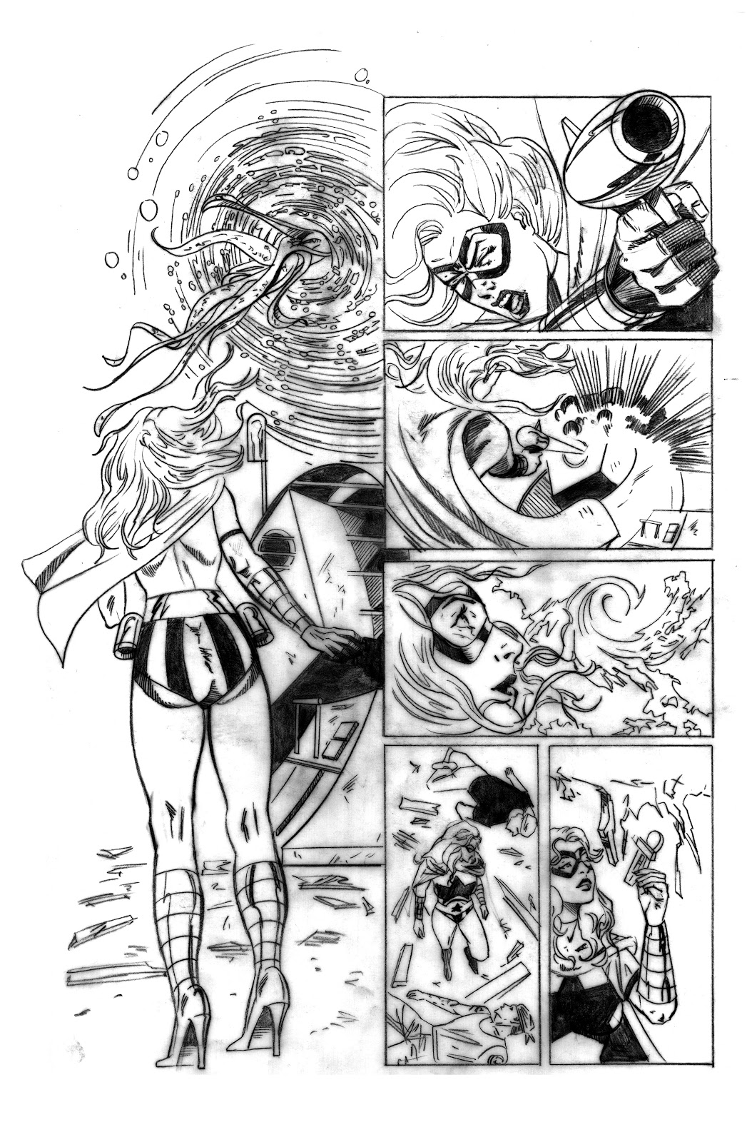
The second time this happened was  for the first big comic book penciling job for Markosia. I was asked to draw 3 issues of a book called Heretic. I gave up my Labor Day weekend in 2007, worked my tail off and "poof!" it was gone, never to be seen again. Looking back at the art I realized how much I learned from the project and how I never, EVER want it out there. Here's a couple of examples:

The piece in my hand isn't nearly as bad as what's
on the wall behind me.

See what I mean?

I only wish the same thing had happened to the single issues of Kong: King Of Skull Island that I had "drawn"...

Currently there are 2 major projects that have been finished for some time that are not yet out. The first was finished back in May 2011 and is supposedly tied up with legal issues. The second was finished in January 2012, solicited for publication a year ago for October 2012, and to my knowledge has yet to be colored. Whether we will ever see them remains a mystery.
This may end up being a blessing...


Wednesday, May 29, 2013

LEN STRAZEWSKI: 5 COLLABORATIONS


Len Strazewski and I on February 14. 2013 in
front of Mike Parobeck's splashpage from Justice
Society Of America #1. See why this piece is so
important to me HERE
Back in February, writer  Len Strazewski showcased some of the comic book work he did in an exhibit  at Columbia College in Chicago.  The exhibit was about collaborations and featured the work of 5 illustrators: Paul Fricke, Norm Breyfogle, Scott Beaderstadt, Mike Parobeck, and myself.

The view from outside the gallery.

The work of Paul Fricke crossed over almost all the artist's
involved, forming a second set of collaborations

Norm Breyfogle's work on Prime is one of Len's most
successful collaborations


Scott Beaderstadt worked with Len on the Archie books


Mike Parobeck's work with Len on the JSA is probably
the most beloved of both their careers


Each of the illustrators had a little biography
including the work done with Len


Some of the Femforce work I did with Len


My work inked by Paul Fricke for Len's upcoming
Superhero business book


Tuesday, May 28, 2013

LEAPING WITHOUT A NET


I have a confession to make: I have a fear of drawing with anything other than a pencil. This does not actually include drawing with charcoal ( which I hate because of it's messy nature and the way it falls apart in my hands), pastels, or painting. What it does include is drawing with pens, markers and ink brushes. Why? Because of ink's permanent nature. It's scary - you put down one bad line, and it's over. Sure, there are "erasing mediums" like various forms of white out, but if they are used wrong they end up making a bigger mess. I ALWAYS use them wrong!

Because of a number of recent developments in my life lately I've started to look at my artwork a little differently. One of the conclusions I've come to is that, while I'm becoming more well versed in understanding what I'm drawing and in my own draftmanship, I'm not really growing as an artist. Growing requires stretching outside one's comfort zone. I haven't really worked on stretching, I've instead painted myself into my own little corner of contentedness.

I saw the chance to start breaking out of this on Memorial Day. On Monday, the Palette & Chisel Academy Of Fine Arts had a day long drawing marathon, with live models from 7 a.m. to 7 p.m. They do this regularly throughout the year on Memorial Day, Labor Day, and New Years Day. I decided to stretch my drawing muscles by using Micron Pens instead of a pencil for some of the quick sketches. Here are the results:


This is just the beginning. In the months to come I plan on doing all my gesture drawings in ink. I also plan on introducing color with both marker as well as water color. There are also a couple of other of things I have in mind as I move forward with this. Stay tuned...


Friday, January 18, 2013

STORMY TEMPEST FOUR: TIME GROWS SHORT!

The following is artwork for the last in a series of 4 short (10 page)  stories written by Len Strazewski, and penciled by me for AC Comics Stormy Tempest character. Stormy was created by Bill Black had been appearing in Femforce as a character from the future who was sent back in time to assassinate a U.S. Presidential candidate. She was captured and sent to prison, then escaped only to end up working as a stripper in a gentleman's club in Vegas. As the tale progressed her antagonist became her former best friend from the future. In this story, we see the aftermath of Stormy's battle with her friend, meet an investigative reporter (loosely based on Newsarama's Jill Pantozzi) and a police detective with his own secret to hide. Unfortunately for writer Len Strazewski and I, this was the last Stormy Tempest feature we would work on, because of a change in editorial direction. I was also in the middle of drawing Moonstone's The Saint and Zenescope's 1000 Ways To Die when the script for this arrived. Because of this I ended up keeping the pencils looser than I would have preferred, especially for the last half. This story was published in Femforce #158 (2012).