Friday, March 30, 2012

How coloring can either add to or destroy art

In an earlier post I talked about color as it relates to shadows and the planes of the body. There is more to the coloring process than just that.

I have a confession to make- sometimes I screw up when it comes to drawing. It happens to every artist at one point or another. Every once in a while I will phone something in. It usually means that I'm not clicking with whatever it is I'm working on, whether it's because of a time crunch or something else. It doesn't happen all the time, but it does happen. In times like that I usually hope the inker or colorist can bring something to the artwork.

Case in point - Len Strazewski's Milos 2. I was not on my game with this story. Unfortunately, not only was I the penciler, but I was also the inker AND the colorist. To be honest, my inks probably made the artwork worse, but I think my colors redeemed it:


I think that there are several reasons why this works better with these colors. The first, obviously, is the shadow modeling. The planes are correct and the light sources stand out. The second reason is that there is a good contrast of colors- warm colors ( reds, oranges, yellows, browns) are next to cool colors ( blues and purples) which makes the figures pop more. Lastly, the dark blue colors and the highlights hide mistakes, whether it be with the anatomy or the composition.

Unfortunately, color has the capacity to destroy the artwork as well. An example of this is what was printed in the Kong: King Of Skull Island trade paperback. A little background is necessary before I show what I mean. When I was first contacted to work on the book, I drew single issues- #3, #5, and half of #4. There was a time crunch and I ended up speeding through the issues. The colors for the single issues were phenomenal. When it came time to collect the issues in a trade, we had more time. I was asked to redraw the art and improve it. Unfortunately, we lost the original colorist and he had to be replaced. Here is the art for both the single issues and the trade:


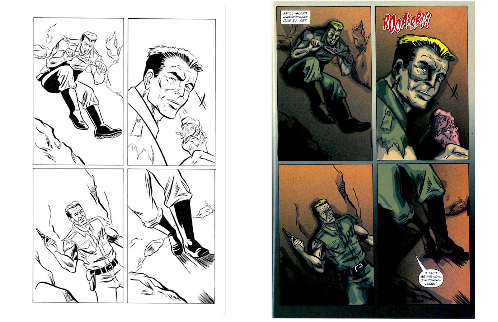
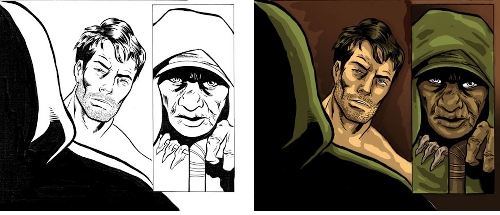
While the b/w art for the trade is better, the coloring is far worse. It makes the art look flat, there is no kind of contrast, and the colors are dirty. The second colorist has no sense of body planes, highlights or color variation - greens are green, browns are browns. The no subtly to any of it. If I had to pick which art looked more pleasing to the eye, I would go with the single issue pages, even though the b/w art had poor anatomy and drawing. The color saves the work.

When line and color come together, they should compliment each other. Sometimes that's not always the case. It is important to note that just because someone knows Photoshop doesn't mean they know how to color. and understanding of anatomy, page layout, and color theory is just as, if not more, important in the digital age as it was in the traditional age.

Friday, February 17, 2012

COLOR: HELP OR HINDRANCE?

One of the ways things have changed in the way comics are done today is the digital coloring. It seems that the possibilities are almost limitless. However, just because someone knows how to place color on a page doesn't mean that they are a good colorist. 

I have had mediocre results when it comes to people coloring my artwork. The problem usually occurs because the person coloring does not understand how shadows fall- specifically the planes of objects.

For example, here is the construction of facial planes, as drawn by Andrew Loomis:


Shadows fall on the face in accordance with these planes. It changes depending on the light source. Here's a nice photo I found on the subject on photobucket:


Below is the colors that were done over my artwork for Kong: King Of Skull Island


As you can see, in addition to muddy colors, the shadows on the faces are all over the place. There is no rhyme or reason to any of them.

Here's another example from Len Strazewski's Milos. 

I didn't want to color the pages myself, so I chose to get someone else to do it. Here are the results:


After I saw this, I knew I had no choice but to color it myself. Here are the final colors:


Though important, this is but a small issue when it comes to coloring, especially digital coloring. I will be explaining more in a future post.

Thursday, February 9, 2012

ON SALE NOW

Here's a book that I worked on for the publisher Zenescope, which is on sale NOW:


1000 Ways To Die

Trade Paperback Vol 1


Based on one of Spike TV's hottest shows, this book pushes the line between life & death.
20 episodes showcase the bizarre, disturbing and often comical way people succumb to death. You have to see some of ways people meet their demise to believe them.


I illustrated 2 stories, based on these  video segments of the show:

Friday, February 3, 2012

STORMY TEMPEST STORY ONE

The following is artwork for the first in a series of 4 short (10 page)  stories written by Len Strazewski, penciled by me, and inked by Jeff Austin for AC Comics Stormy Tempest character. Stormy was created by Bill Black had been appearing in Femforce as a character from the future who was sent back in time to assassinate a U.S. Presidential candidate. She was captured and sent to prison. This is where Len and I inherited the character. Len had some plans for where Stormy's saga was going to go, but first he had to get her out of prison. He also felt like she should get a job at the end of the story that reflected the character's roots ( She is loosely based on Las Vegas burlesque star/ stripper Tempest Storm) The art is my pencils next to Jeff's inks, and the story appeared in Femforce #152 (2010).


Tuesday, January 24, 2012

LIFE DRAWING PART 10

Life drawing sometimes feels like eating or cleaning- it's a never ending process. There is no such thing as finishing one class or reading one book and being done with it. In order to keep my skills sharp, I like to go back to drawing anatomy as well as drawing from a live model as much as I can. I can do this whenever I have an opportunity usually in between projects.

One of my favorite figure drawing/anatomy books is a series by George Bridgeman. Here are some recent drawings I've worked on:


In addition to this, I've been going to live figure drawing sessions on the weekend at the Palette And Chisel Academy Of Fine Arts Chicago. The sessions are "quick sketches" going from one minute to 60 minute drawings.

5 minutes

5 minutes

10 minutes, 15 minutes,                 25 minutes


25 minutes

25 minutes


It is essential for any artist that draws human beings to go back and do live figure drawing and anatomical studies from time top time. It is the only way to, not only remain sharp, but to also improve skills.


Friday, January 20, 2012

HAVING WORK FINISHED PART ONE-INKING

One of the things I've been very lucky with in my career as a comic book illustrator is the inkers I've worked with. With the exception of a couple of small stories I've been fortunate enough to work with true professionals who have not only added to, but also changed the way I approach my work.

For anyone who doesn't know, inking is the act of refining comic book pencil art by adding permanent ink linework and blacks to the art over the pencils. There have been projects that are not inked but instead are finished worth super tight pencils, like the recent work I've done with Zenescope and Bluewater. I have also  sometimes been required to ink my own work like the third Stormy Tempest story I did for AC Comics a year ago:


As fun as these things are, I actually think that it can be more fun to see how someone else interprets my work and adds their own flair to it. The first time I experienced this was with Jeff Austin, my inker on the AC Comics work I did. I think that Jeff has an Alfredo Alcala style that really added to an enhanced my work. I realized, after seeing his work over mine, that I really needed to step up my game.


I was absolutely thrilled when I saw the work that Paul Fricke did on a recent story I just penciled. Paul is the co-creator of Trollords, author and illustrator of Night Of The Bedbugs, and inked Mike Parobeck on DC Comics/Impact series The Fly.  Paul's inking, which was done digitally was of a simpler style than I drew the pages. It reflected my originals but also was very much his work. I love how this came out:


The last image is the cover of Bluewater's Victoria's Secret Service #1, which is due out this June. Originally, the covers were going to be colored from my pencils, but my friend Andrew Pepoy expressed interest in inking them. Andrew has worked on everything ( and I mean EVERYTHING)- from stories published by Marvel, DC, Darkhorse, and Archie Comics to designing a new look for Little Orphan Annie and creating a tap dancing superhero musical play. It has been a real honor to have him ink my work.


While I've been happy with this part of the process of comics creating, there are others which can seriously affect how someone's work looks. More on that next time...


Friday, January 6, 2012

ON SALE NOW AND COMING SOON

Here are a couple of projects that I've worked on which are both out now or will be shortly:

Neverland: Hook Issue #2

I penciled pages 12-24 of this issue.


As Belle hovers near death, Cross continues his search for the monster that attacked her. It’s a search that leads him back to the place where his childhood nightmares still live… Neverland. Cross will soon learn that the monsters he’s faced in the past are nothing compared to the horrors that live there now. 

This book is published by Zenescope and is in stores NOW. If your local comic shop does not have it, you can ask them to order it, or get a copy HERE

FEMFORCE #158

This issue features the final 10 page story of the  Stormy Tempest saga, written by Len Strazewski and penciled by me.


Trapped at submicroscopic size inside Synn's body, Nightveil, Stardust and Ms. Victory defeat a foe of unimaginable menace, as She-Cat finds a face out of her past. Then, no sooner is one evil opponent dispatched, when a new villainess appears - from the ranks of the undead! Behind the spectacular digital cover painting by long-time Dark Horse Star Wars artist John Nadeau, Femfans will finally learn the source of Synn's vacillations, and the terrible price that must be paid to end them!


This issue is being shipped to Diamond distributers on January 20th and will be out soon after. The best way to get a copy is to order it from your local comic book shop or online.