Tuesday, April 5, 2011

INFLUENCES PART 11


Mike Sobey is one of best commercial illustrators in the city of Chicago. I have learned a great deal in the past decade that I've worked with him at Steve Edsey & Sons. Mike's work consists mostly of advertising art, although he did illustrate some covers for Rick Lundeen's  self published graphic novels.


Mike has a number of distinct styles. The one in which I learned how to marker comps and paint from is his realistic tone-on-tone storyboards:


He also does event sites:


And a style called "loose line":


He employs, in his black and white work the "60/40 rule" What this means is that in order to have good balance in b/w, artwork has to be either 60% black & 40% white or vice versa. I try to keep this in mind when working on the b/w Femforce art:


Mike Sobey's artwork can be found HERE and HERE


Monday, April 4, 2011

THE CREATIVE PROCESS PART 10- ROUGH PENCILS

In my process of drawing, I usually do 3 sets of 3 pencils for each page. The first set of roughs is done by using my photo page as an underlay and drawing it backwards on vellum.

Example of backwards photo page. this particular story 
( printed in Femforce #152) had less photos and 
more comic booky action shots

After the first set of roughs, I flip the vellum over and use that as an underlay to create the second set of roughs. This second set serves to correct the mistakes of the first set. The second rough is then scanned and set to the editor for approval:


Once this rough is approved I go to finish:


The purpose of drawing the first rough backwards is that it's easier to correct mistakes on the second, so that when I get to the finished pencils all the problems have been fixed:


This is the first rough for the Stormy Tempest story
that appeared in Femforce #155. Something didn't seem right 
to me about the first panel.

This is the rough after the corrections were made.

This is the finished pencil page

Sometimes, the corrections don't get fixed in the second rough. When this happens, the final pencil is where the corrections must take place, or they stay in the printed artwork.

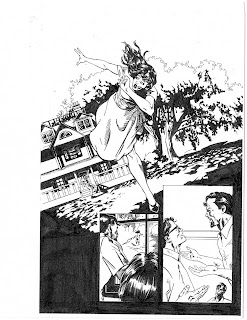
Here is a rough that, because of timing issues, went straight to ink 
at this stage without a final pencil. Take a look at the first
panel. The background is disproportionate to the foreground. 


As you can see, the tree is really large in comparison to the house. Unfortunately,
the finished printed page had this mistake in it.


Although the finished inked page had the proportion problem, I went back
and finished the pencils on the page. This is how it should have looked.

For me, rough pencils are an essential part of the process of drawing. It might seem like more work, but in the end, the pages look better because of it.


Friday, April 1, 2011

KONG: KING OF SKULL ISLAND #5

Kong: King Of Skull Island, was a 5 limited series that was published by Markosia. It was based on a book illustrated by Joe Devito and co-written by Brad Strickland.  The book was a sequel to the King Kong story, following the footsteps of Carl Denham's son, Vincent,  as he travels to Skull Island to locate his missing father. In the course of the story, we discover Kong's backstory. I had the pleasure of drawing issue #3, the second half of #4, and all of #5.


In the pages that follow, redrawn for the trade paperback, Kong fights the dinosaur Gaw in an epic, climatic battle:


The book, Kong: King Of Skull Island, by Joe Devito and Brad Strickland can be found HERE and the TPB ( that I drew) is HERE

Tuesday, March 29, 2011

INFLUENCES PART 10

I had mentioned a couple of months ago that in addition to classroom figure drawing, I also learned a lot out of books.

There was a series of books, initially centering on figure drawing and anatomy and later delving into light and shade and clothing wrinkles. The books were written by an illustrator named Burne Hogarth who had not only had been an illustration teacher, but had also drawn the Tarzan comic strip for many years.


The books are full of information. They have been, and still are, incredibly helpful when it comes to drawing human proportions, dynamic movement, clothes, and shadows. The anatomy is very stylized and a knowledge of the actual anatomic structure is important to have before embarking on what Hogarth is teaching.

a few drawings I did out of Hogarth's books back in the early '90's

I can not recommend Burne Hogarth's books enough. Luckily, even though he passed away some time ago, his books are still in print. They can be found HERE

Monday, March 28, 2011

THE CREATIVE PROCESS PART 9-PHOTOS

A couple of weeks ago I got this great script from AC Comics. They are doing a one-shot devoted to the character of Miss Masque. They asked if I draw  an 11 page story written by David Watkins. The story, the plot of which is top secret, is called: The Funny Face Of Death!

This is NOT the cover, but it is Miss Masque!

So after I worked out the thumbnails, I set up a photo shoot. I usually take photos in order, more than anything else, to get correct portions of people. The places where the photos have been shot vary, from my apartment, to buildings around Loyola University's campus. For this story, it seemed like a good idea to take the pictures in the stairwell of office building where I work in downtown Chicago. The nice thing about that environment was that I could take photos from different angles. The bad thing was that we got interrupted by people using the stairwell to go to a different floor:

This lady thought it was a good idea to walk in just as I 
took a picture of one of my models.

My model for Miss Masque is coworker Gwydhar Gebien. Because I can't reveal anything about the story yet, I thought I'd share some of the pictures I took. Hopefully you'll be able to tell what an exciting story it will be.


Miss Masque Strikes Back #1, published by AC Comics, will be out in July 2011.

Wednesday, March 23, 2011

C2E2 2011 Part 2

This past weekend was the 2nd annual Chicago Comics and Entertainment Expo, also know as C2E2. Always an interesting time, the convention, allowed fans to interact with creators, buy comics, and attend events.


One of the events was a costume contest for each of the 3 days.. People sometimes dress up for conventions, contest or no.  I've seen some neat outfits at the San Diego and New York Conventions, but was really impressed with what I saw over the weekend.


Tuesday, March 22, 2011

C2E2 2011 Part 1

This weekend in Chicago was the 2nd annual Chicago Comic and Entertainment Expo, also known as C2E2. This is the first of 2 conventions that we have here in the Windy City ( the other happening in the summer).


Conventions are always fun because they allow me not only to talk to different publishers, but also to buy lots of old comics. I usually hit the 25 cent bins and find collections that I make into bound volumes. C2E2 had a 10 cent been which was the epitome of a feeding frenzy. 

In addition to checking out the festivities, I was also able to visit with some of my professional friends in artists alley:

This is Newsarama and MTV Splash Page columnist Jill Pantozzi holding a painting
 I did of her for her birthday. Jill is my favorite comics reporter, despite her unhealthy 
obsession with Batman. Her blog, The Nerdy Bird, can be found HERE


Kyle Bice showing off one of his fantastic watercolor paintings. Kyle's a very
talented artist who attended American Academy Of Art with me. He's also married
to Natanya Rubin, who is my model for Stormy Tempest. Kyle's artwork can be found HERE


John Siuntres hosts, what has to be the best comic book related podcast around, Wordballoon.  He's interviewed the top comic creator's and I've found his program to be incredibly inspirational. Episodes can be found on the WB website as well as on itunes HERE


Jenny Frison is one of the best illustrators of comic book covers today. She's got a very 
unique way of working that mixes both traditional illustration with digital. Jenny's 
also one of the nicest people I've ever met. Her artwork can be found HERE and HERE


Jason Millet is a friend and fellow Chicagoan who works on both comic books and 
advertising illustration. His artwork can be found HERE


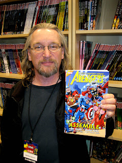
On Sunday, I got to spend some time with Al Vey, who has inked 
many pages for both Marvel and DC Comics. Most notable was the Kurt Busiek/ George perez run on the Avengers. The first volume of which can be found HERE


Inker Andrew Pepoy, friend and mentor who I have known for a very 
long time. Andrew's currently doing some excellent work for Archie Comics
His work can be found HERE


Steve Bryant works on Athena Voltaire and is a very talented 
and extremely friendly guy. His artwork can be found HERE

Most of the artists are Chicago based, but also do conventions around the country. They do fantastic work and are worth taking he time to check out.